Organic progression
The spiral suggests growth that returns, develops, and builds on what came before.
You Only Live Once
Identity / Guidelines / Applications
Overview
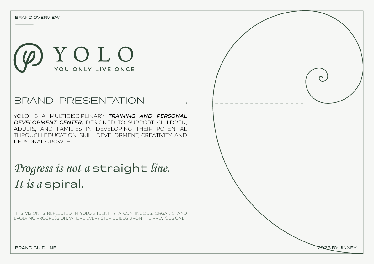
YOLO is a multidisciplinary training and personal development center created to support children, adults, and families through education, skill building, creativity, and personal growth.
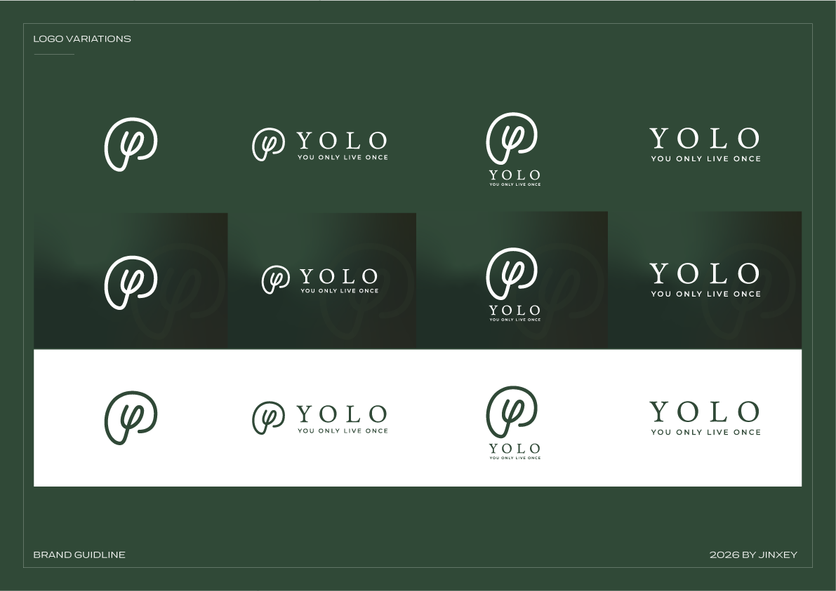
The identity treats progress as a spiral rather than a straight line. A soft, continuous monogram brings learning, intelligence, and transformation into one calm symbol.
The system
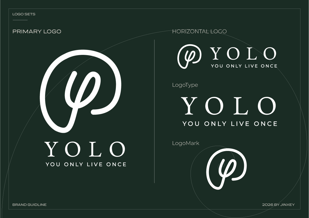
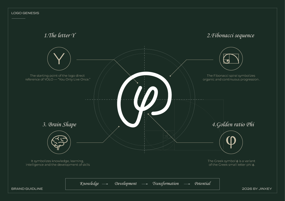
The symbol begins with the letter Y and develops through the logic of a Fibonacci spiral, the contour of a brain, and the form of phi. The result feels organic, intelligent, and open-ended.
The spiral suggests growth that returns, develops, and builds on what came before.
Forest green, generous space, and refined typography give the center a thoughtful, supportive voice.
Applications
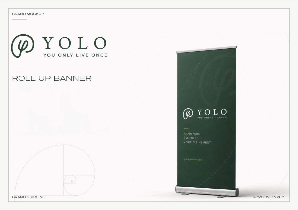
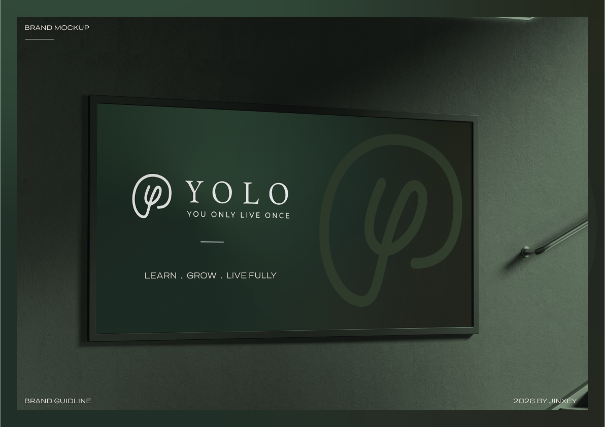
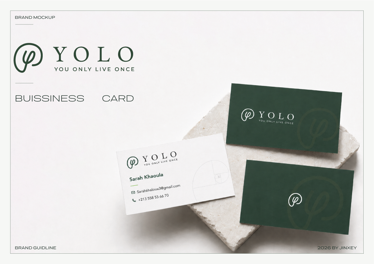
The identity moves from guidance to everyday contact points, keeping the same calm clarity across print, signage, and presentation environments.