
Continuous route
The S-shaped path gives the symbol its movement, while the pin-like tips connect the idea to place and arrival.
Driven by Data. Designed for You.
Identity / Mobility / Digital
Overview
Stationi is a visual identity for a data-led smart-parking concept. The system turns an everyday arrival into a clearer, more confident experience.
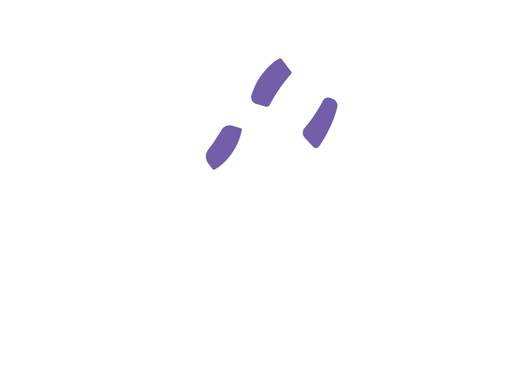
The S-shaped mark combines movement and spatial guidance in one continuous path. Three violet intervals behave like signals, giving the identity a distinct digital rhythm without losing its human character.
Brand board
The core identity is intentionally compact: one unmistakable mark, a high-contrast lockup, a focused palette, and a line that explains the promise in plain language.
01 / Primary mark

02 / Name
STATIONI Driven by Data.03 / Core palette
04 / Typography
Aa Bb Cc
SZTOS SEMIBOLD
Sztos Light
05 / Principles
06 / Lockup
The system
Black and white provide immediate clarity. Stationi violet carries the digital signal, highlighting motion and information without competing with the core S silhouette.
The S-shaped path gives the symbol its movement, while the pin-like tips connect the idea to place and arrival.
Three violet segments add a data rhythm to the mark and remain consistent across the supplied identity assets.
Applications
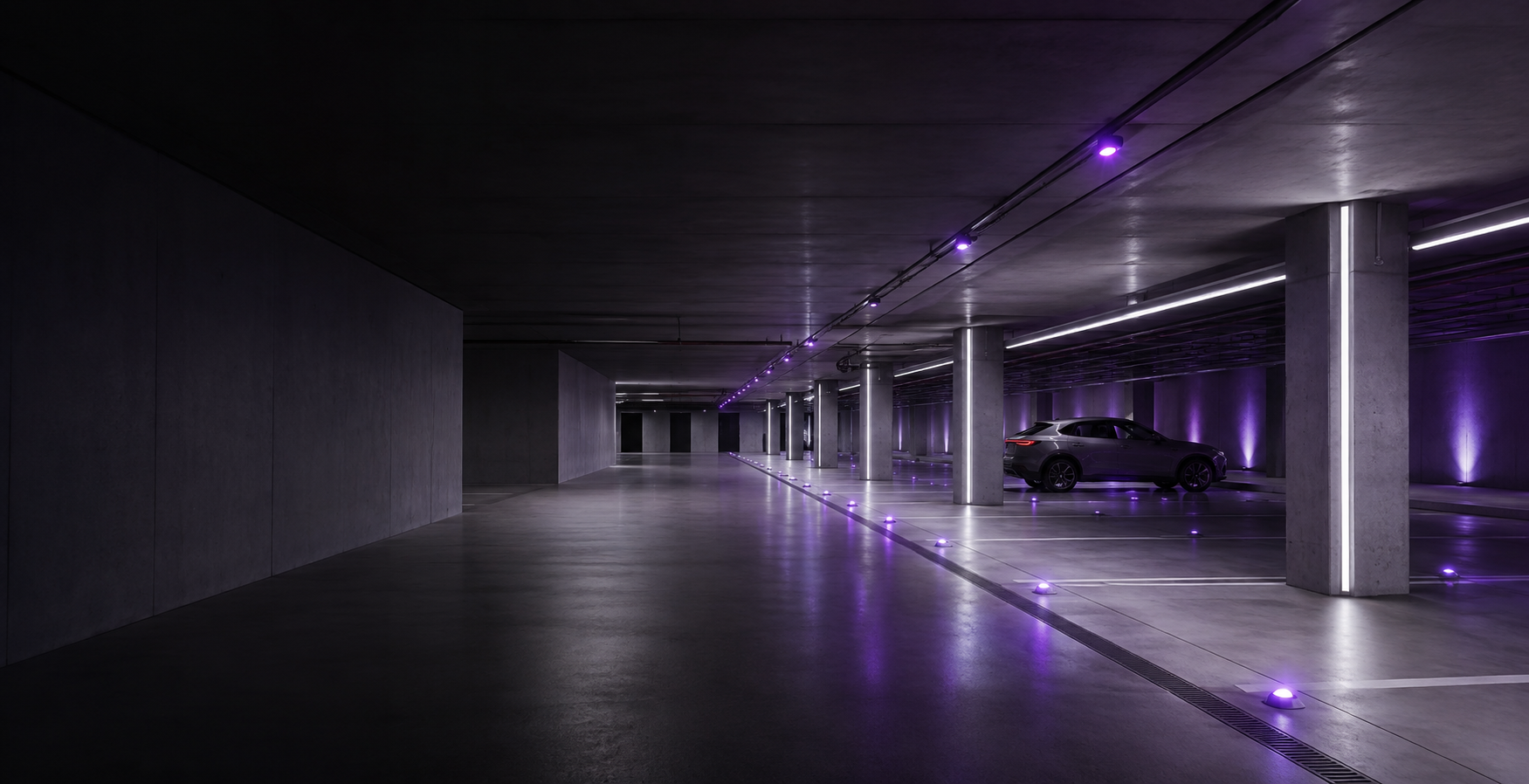
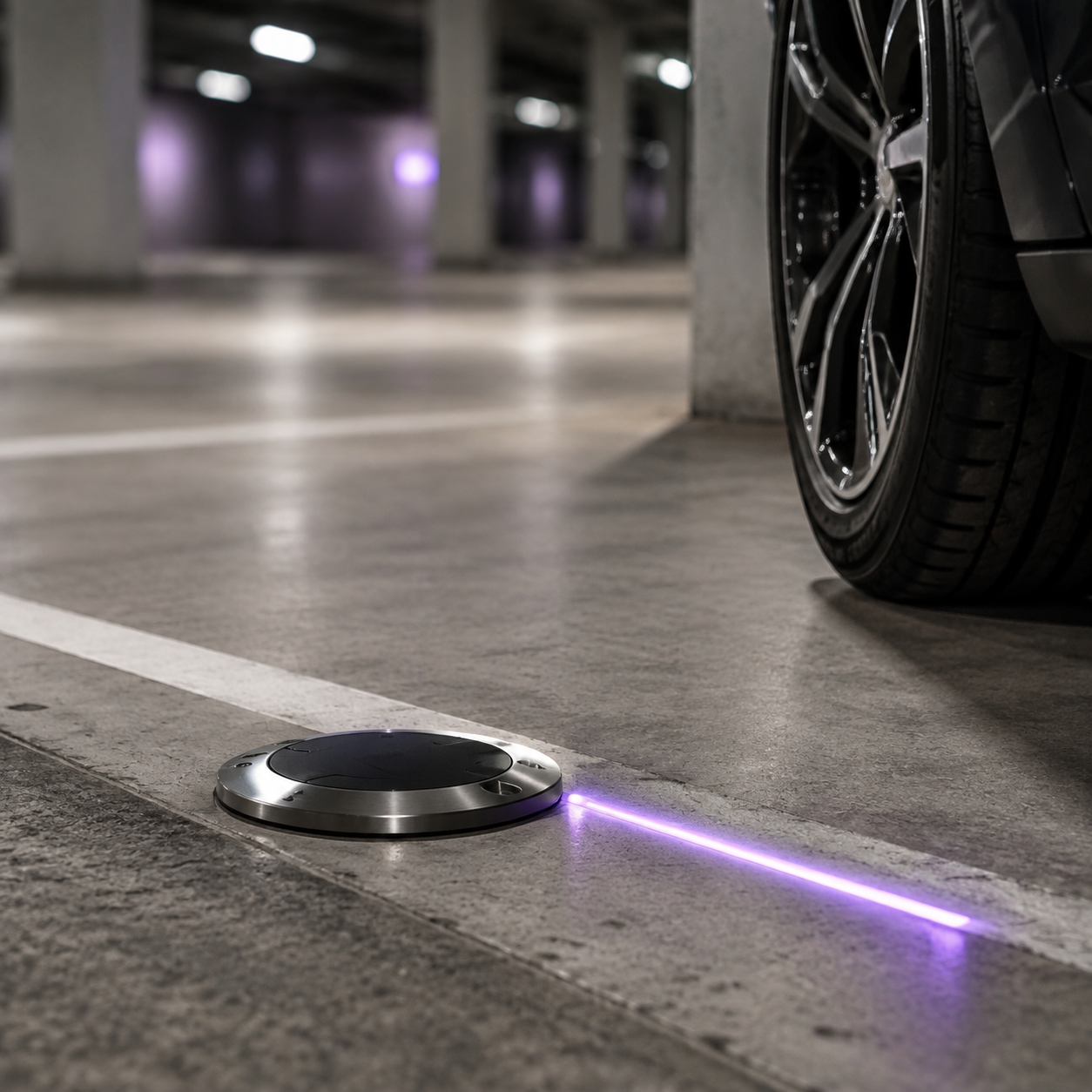
The identity can move naturally from a digital interface to the physical parking environment—always clear, direct, and recognizably Stationi.
DATA
DIRECTION
PLACE