Progression mark
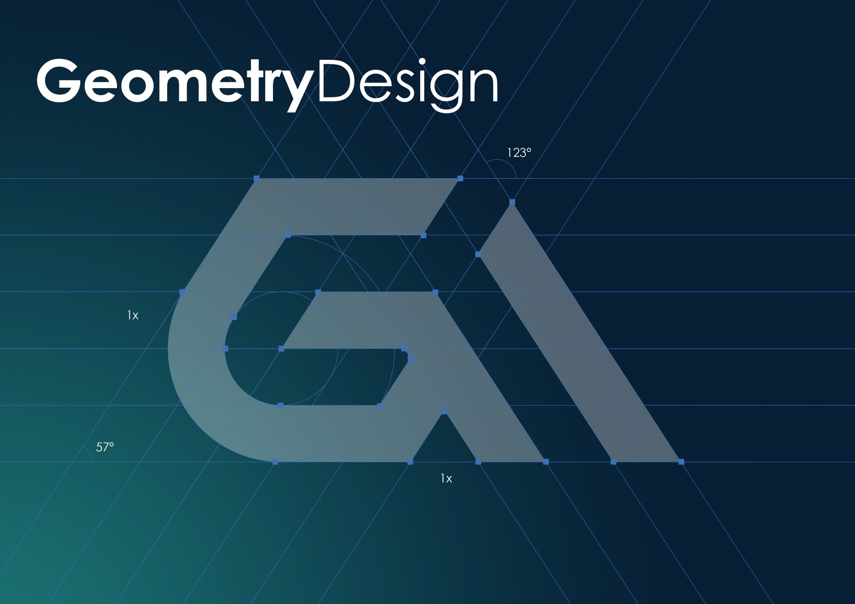
An upward arrow, the number one, and initials are fused into one compact modular unit—direct, structured, and easy to repeat.
من المشروع إلى المؤسسة
Identity / Guidelines / Environment
Overview
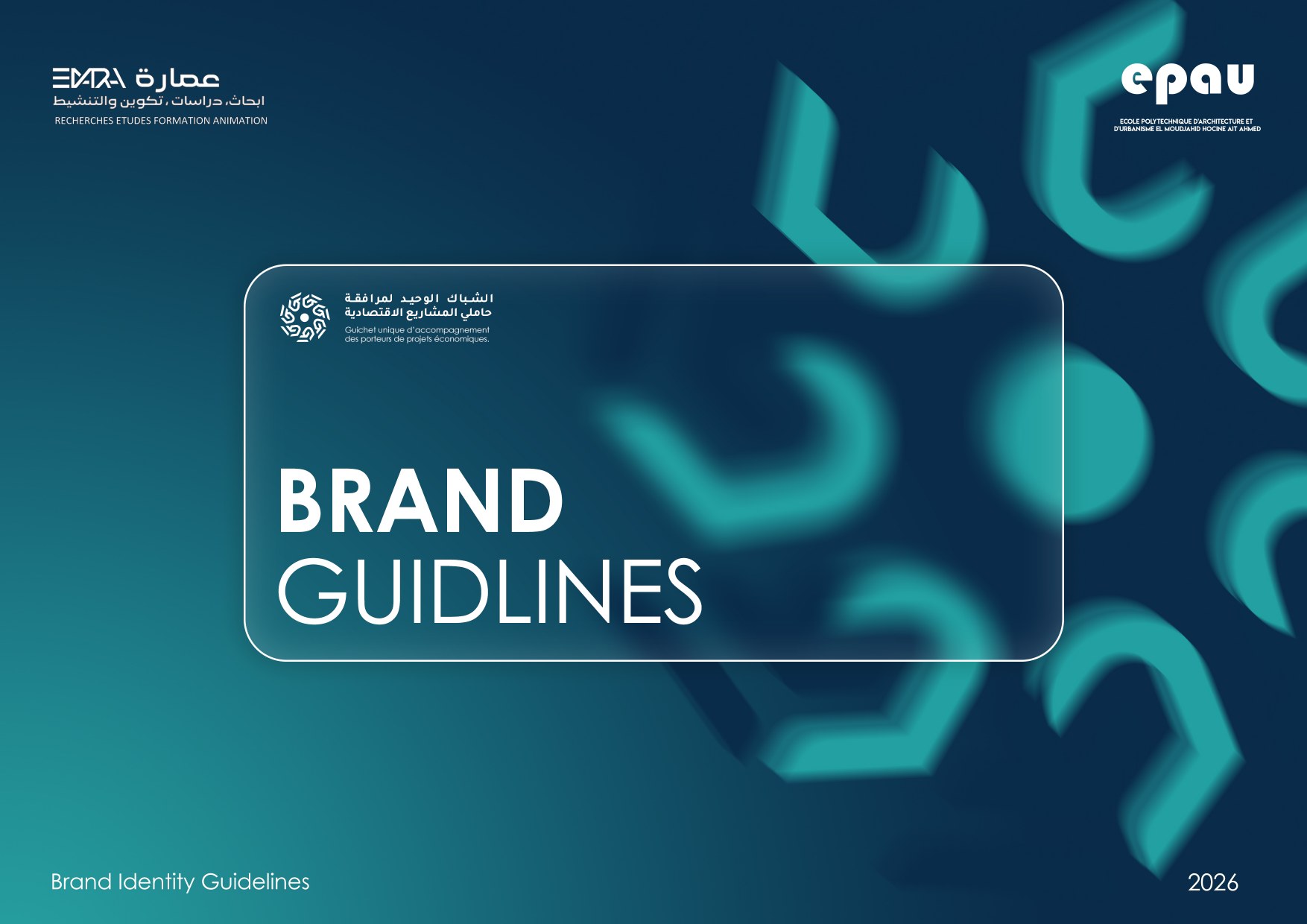
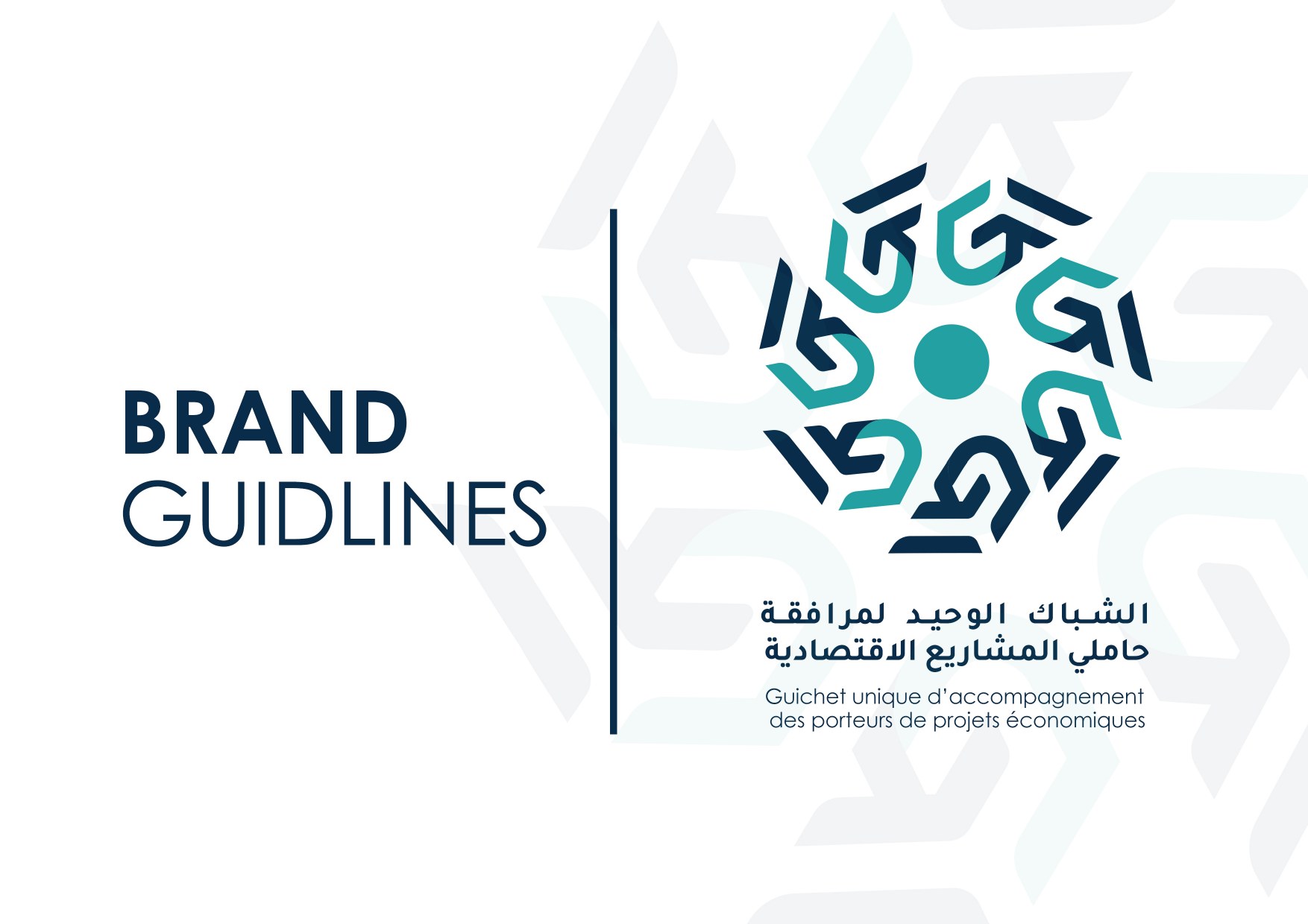
A bilingual identity for the Guichet unique d’accompagnement des porteurs de projets économiques—a single point of support for people moving an economic project toward an enterprise.
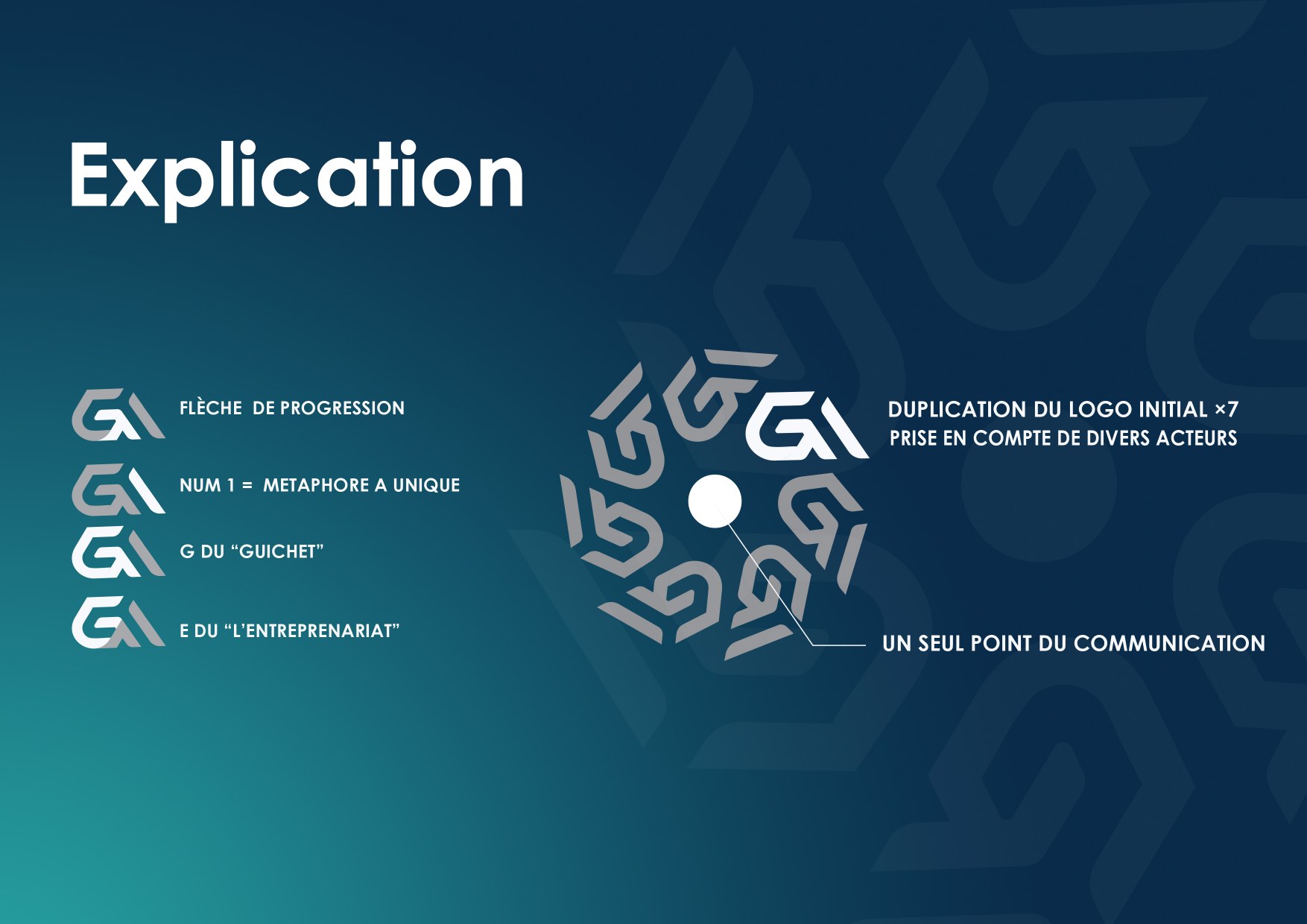
The mark combines a progression arrow, the numeral one, and letterforms derived from “Guichet” and “Entreprenariat.” Repeated modules orbit a central point to represent coordinated support.
The system
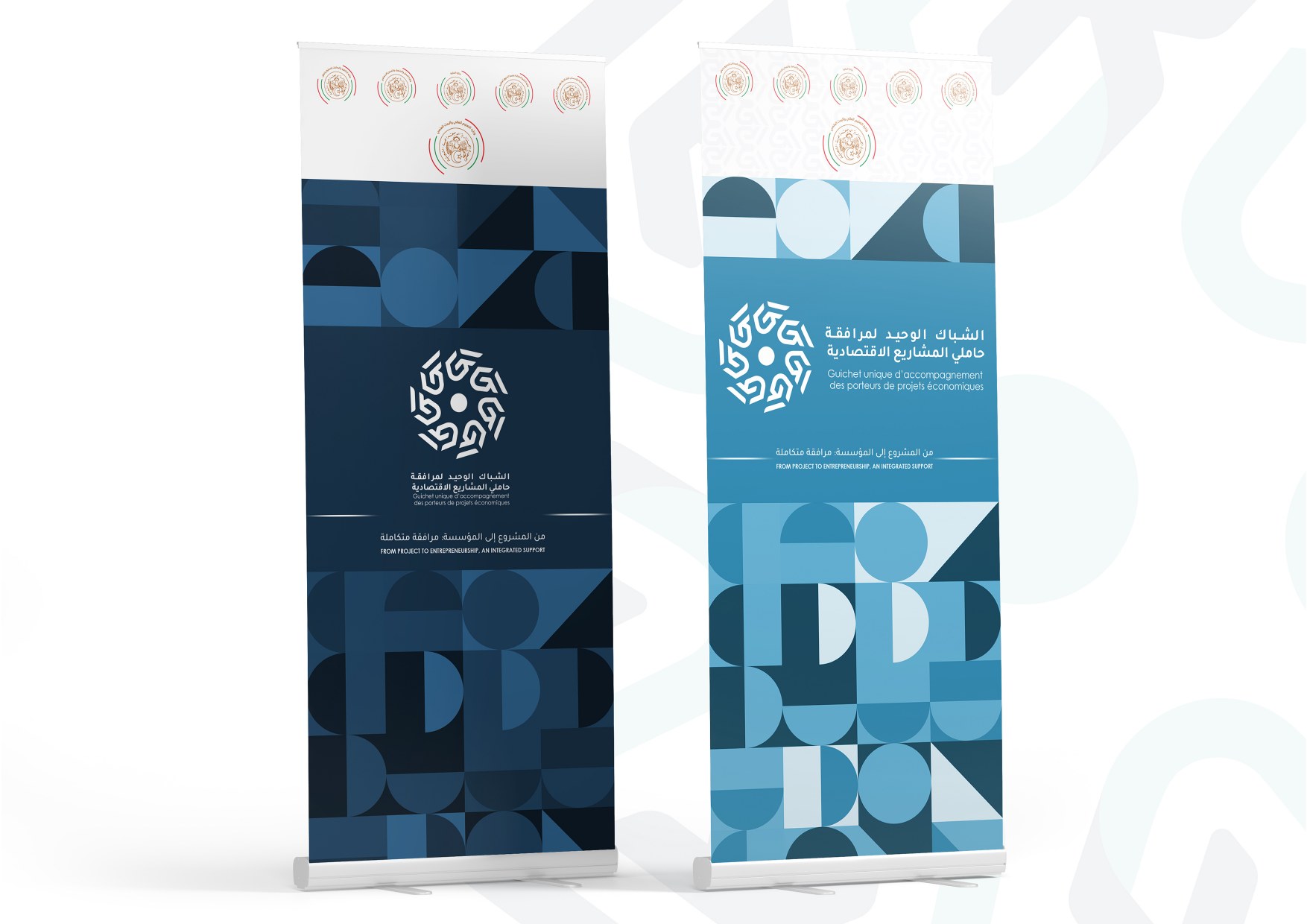
The system balances public-service clarity with entrepreneurial movement. Blues organize information, gold signals progression, and neutral tones give the layouts room to breathe.
An upward arrow, the number one, and initials are fused into one compact modular unit—direct, structured, and easy to repeat.
Seven repeated modules create a circular field around one center, expressing multiple actors working through a single point of communication.
Applications
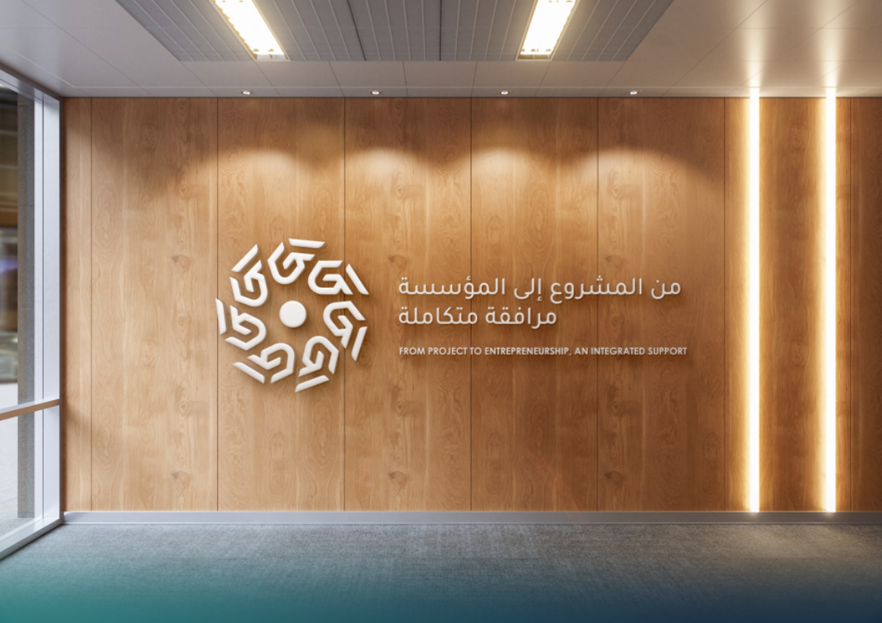
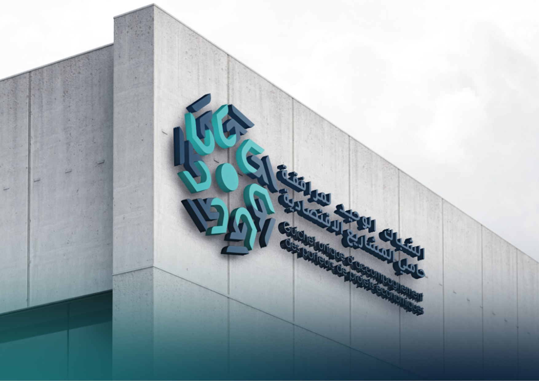
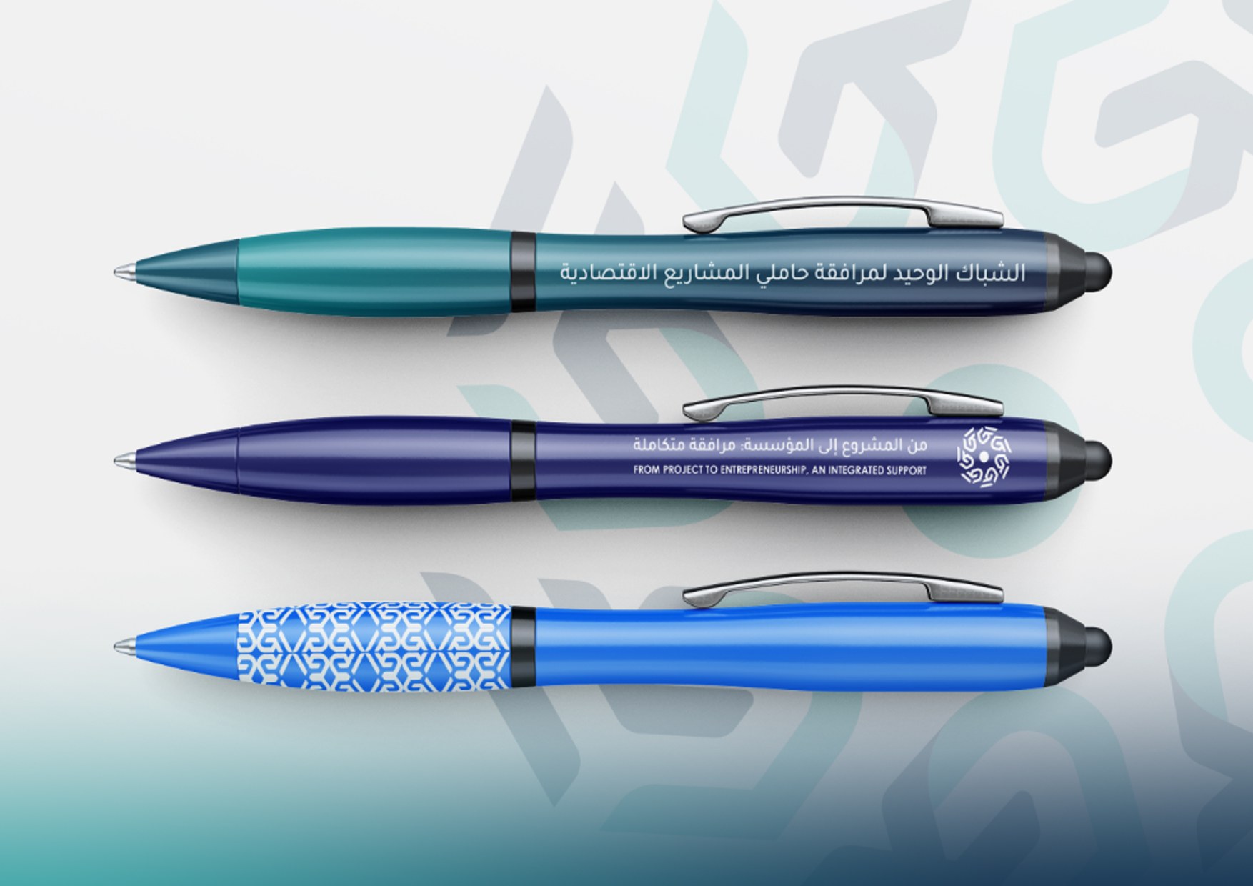
The language extends across information points, interiors, facade signage, event displays, stationery, and everyday objects.